August 21, 2020 : Hologram Goodness
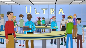
I just completed a set of sequences, and they required Holograms. I previously discussed the Holographic Timer, which borrowed techniques from Ultra – an older short of mine neither critically nor commercially successful – with some tweaks.
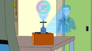
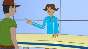
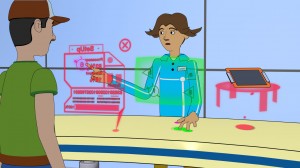
A new graphical element needed for this part was a Holographic projection of a character. I wanted to have some fun with this since had never done the effect before, but I also needed it to stay consistent with the Timer. Below is a screenshot:
I’m very happy with the end result. However to really sell the visuals, I realize the need to have solid accompanying audio effects. I’ve already placed in a lot of SFX for earlier sequences, and as always the case, it makes things so much better. I expect the same to happen with the Hologram sequences.
posted by Pi Visuals at 11:55 pm
Tags: After Effects , MeAndMe , UltraComment
July 25, 2018 : Walking Through A Portal – Animation Testing
Building off an earlier post, I spent some time having a character walk through my cartoon portal. Below is the end result (with sound effects):
You might recognize the character from a previous animated short, which was actually the inspiration for the portal idea. That earlier project is nearly 5 years old (?!). Since then, I have made numerous improvements to my rigs. However, I didn’t feel it prudent spending time creating a new or updated character at this juncture of testing.
Overall, I like how things came out. I might tweak a few things when I actually create the portal for realsies, but I like the After Effects portions used. Plus, I feel the audio really pulls everything together.
posted by Pi Visuals at 3:35 pm
Tags: After Effects , Lightwave , MeAndMe , UltraComment
June 6, 2016 : New Ultra Vector Artwork
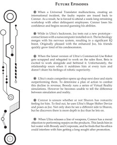
I recently dusted off Ultra and created a quick document that summarized the intent of the project if it were to become a series (a mini-Pitch Bible of sorts). I limited it to four pages but made sure it covered the essentials: a general overview, character bios, and potential future episodes. To spice up the document – and prevent it from being too bland – I created some vector artwork to accompany the text.
As you’d expect, this was done in Illustrator. Coming up with the design took some time. It wasn’t easy creating a graphic that wasn’t a still image from the animation. It needed to capture the essence of Ultra without focusing too much on a particular character or event. Plus it needed to be black and white to complement the text. Ultimately, I was making a logo, and I was happy with the end result. It was placed off to the left of each page:
The graphic ensured the pages weren’t too text heavy. Having just a bunch of paragraphs would have made the document much less appealing to read. Overall, I was very pleased with the layout template for each page. As a side note, the bullet points were also made in Illustrator, and I felt they were a nice touch.
posted by Pi Visuals at 1:48 pm
Tags: UltraComment
August 5, 2014 : I Christen Thee… Piccolo
To say it was long overdue would be an understatement, but I finally got myself a new computer! This is the first new one I’ve had in 8 or 9 years; and to make sure if fully met my current and future production requirements, I decided to build it from scratch… something I have never done before. Seeing as how I wasn’t very knowledgeable about computer hardware, I had to do a lot of research into the various components.
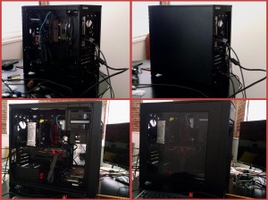
It took some time and a great deal of effort, but the end result is the computer you see below (with and without side panels). I call him Piccolo.
I am very stoked to have a computer that can easily (and quickly) handle the programs used for production. Granted, I still need to install most of these, but I’d like to think most of the hard work is over. This is technically the third computer I’ve owned that was built from scratch, however the first two were put together by Moridin.
In case you’re curious about the name, I give all of my computers DBZ character names. This is the fourth one. The first one was Vegeta (obviously), who was one of the home-built computers I mentioned above. He was followed by Gohan, which was a Dell. I then received a used, home-built computer (mostly for music recording and additional storage), and it was named Tien.
And now, I can add Piccolo to the list. I considered naming it Trunks but felt the Saiyan race was already well represented. For the record, Vegeta is no longer with us. He died a painful death a few years ago, presumably at the hands of a virus named Frieza. Gohan and Tien are both still in my arsenal and was used to make Ultra. However, they are sorely outdated, and I have been questioning their usefulness for quite some time now. I briefly considered changing their names to Yamcha and Krillin…
posted by Pi Visuals at 9:54 pm
Tags: DBZ , Pipeline , Ultra2 Comments | Post a comment
June 28, 2014 : Ultra’s Intro Animation
I meant to share this earlier in the week, but apparently it slipped my mind. Below is the Intro animation for Ultra.
It was created entirely in After Effects and took several iterations to get exactly how I wanted. This is also the first Intro Animation of mine that isn’t accompanied with music. Instead, I chose to use strictly sound effects. It was a decision I went back and forth on for quite some time, but I ultimately feel like the right choice was made.
posted by Pi Visuals at 1:59 pm
Tags: Ultra0 Comments | Post a comment
June 20, 2014 : Closing Days For Ultra
Things are wrapping up on Ultra… and quite nicely, in my opinion. At this point, it’s a matter of getting the final specs on the rendered clip. Sadly, things like this always take longer than expected. Still, the hope is that everything will be completed by the end of the weekend. Below is an establishing shot of the store:
The shot is the first thing you see after the Intro Animation. I like its simplicity. For some reason, I originally intended to have outside, ambient noise playing over the shot. Instead, I decided to create a quick establishing musical number. This can be heard below:
[audio:http://www.pivisuals.com/wordpress/wp-content/uploads/2014/06/Scene1EstMusic.mp3|titles=Ultra Est Music]In the past, I would record these short establishing pieces at the very end of production, and several times I felt the music suffered because it was rushed in the process. Not having identified the need for this piece until last week, I didn’t have much of a choice in prolonging the writing/ recording of it until the end of production. However, I like how it came out. I think it goes well with the theme of the short – and thus it helps establish things.
posted by Pi Visuals at 11:19 pm
Tags: Ultra0 Comments | Post a comment
June 14, 2014 : Ultra’s Title Card
I haven’t revealed the name of the short I’ve been working on these past few months. I suppose it’s been intentional, but it is mostly because I was waiting to complete the Intro animation before doing so. Although, technically if you were observant enough, you would have seen the title since it was the tag for each post about the short.
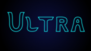
Anyway, the Intro animation is complete, and below is the Title Card for the short:
Intro animations are always difficult. They are the first thing the audience sees; but since they are often not part of the original story, they are put together more as an after thought. In my opinion, the importance of the intro cannot be understated. That is why I try not to rush them, which is also why it took so long for me to complete it – it took me a while to come up with the look and feel that felt right.
Overall, I like how the Intro animation came out. Unfortunately, it is not yet online for anyone to view. Perhaps, I will share it in the next few weeks, but no promises. At the very least, you were able to check out the title card for the short. So… you’re welcome.
posted by Pi Visuals at 12:50 am
Tags: Ultra0 Comments | Post a comment
June 10, 2014 : Establishing Crowd Shots… Such A Pain
Establishing shots are necessary at the start of a scene to tell the audience where they’re at. They sound simple enough, but I hate when this shot occurs in a crowded area. This requires a great deal of time (and resources) to adequately convey a populated location.
This new short starts off in a store, which is supposed to be pretty busy. Audio can help with setting the tone, but fortunately I had enough models from previous projects to throw into the scene that created a satisfactory crowd scene.
Can you determine how many previous projects, excluding this one, are represented in this shot? Here’s a hint: it’s not three.
Several of these models will be used as additional non-animated background characters to help keep the illusion of a crowded store. However, this initial establishing shot was the only one that needed to have all these characters in it – and that’s a good thing because my computer does not like loading very many models into one Lightwave scene file. I was forced to break it up into sub-scene files, which required that much more time to generate this shot. I guess that’s just another reminder I need a new computer.
posted by Pi Visuals at 1:59 am
Tags: Ultra0 Comments | Post a comment
June 5, 2014 : Post-Production Underway
A few more establishing shots and re-renders need to get taken care of, but that hasn’t stopped post-production from getting started. As with many of my projects, a decent amount of After Effects work is needed to put everything together. A few of the shots in this sequence will really depend on After Effects to sell what’s going on.
This is especially true with the first non-establishing shot of the short. Below is a composited render, which only takes the various renders from Lightwave and puts them in the necessary order.
At this point, without the audio, it isn’t entirely clear what’s going. Once the necessary After Effects layers are added, the audience gets a better feel for the world presented to them:
While I like this still, I think the animation for the entire shot looks even cooler. Sadly, that is something I cannot share at the moment.
Here
posted by Pi Visuals at 1:33 am
Tags: Ultra0 Comments | Post a comment
May 28, 2014 : First-Pass Animation Wrapping Up
With the exception of a few lingering establishing shots, the first-pass animation is complete. Some sequences might need to get tweaked once reviewed, but hopefully these changes will be minor.
This short has more characters than several of my previous projects, and each has something I really like about them. Below is a render of one of them:
This character required some extra time to figure out how to facially animate (for his dialogue). Thanks to Moridin, a solid solution was found.
There are still plenty of items that need to get done: background renders, sequence reviews, plenty of After Effects, sound effects, and song mixing to name a few. With the deadline for the short under four week away, busy times ahead.
posted by Pi Visuals at 11:03 pm
Tags: Ultra0 Comments | Post a comment

