July 18, 2017 : Rig Improvements – Head/ Face Edges (Part 2)
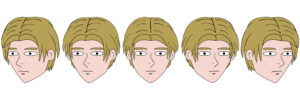
In the previous post, I introduced changes made to my rig around the head/ face area for my recent project. This required a drawing at five different head positions for each character and projecting each onto a flat plane.
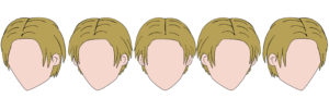
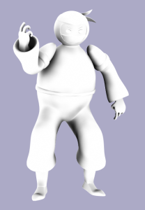
Since I animated the eyes and mouth within Lightwave, these drawings were actually temporary. The final image used for the final projections actually looked like this:
The eyes, nose, nostril, mouth, and chin mark were then modeled in Modeler – with morphs created for the eyes and mouth. This borrowed the technique I used in a previous project, Taking Shape (although the separate eyes was used in a project prior to that, Ninja Tales).
Technically, I did not need to model the nose/ nostril and instead could have kept the drawn version from the temporary file. However, I liked having more control over its rotation, position, and scale in Lightwave.
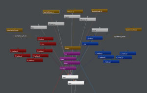
Each feature of the face had its own bone, which were all parented to the head bone – the bone that controlled the position and rotation of the face image planes. Below is a schematic view of this portion of the rig:
One of the main characters also modeled the front two bangs for additional animation control, which is reflected in the image above.
For each of the five different head positions, I placed the facial features in their correct position and scale (for the nose, I also had to adjust its rotation. These keyframes were saved in the base Rig Scene for the character, and then I was able to copy these settings at any point within future scenes.
If a movement required a head turn, I would simply sequence the keyframes as needed (usually on 1’s or 2’s, depending on the movement). This could have been better automated/ controlled and might be something I pursue in future projects.
Overall, this process wasn’t very difficult or time consuming to create since I reused many of the facial features. Thus they didn’t have to get modeled from scratch each time for every character. It did take a few extra minutes to animate head turns, but it was worth it for the additional control of the edge lines.
For the last part in this series of posts, I will discuss how the movement/ orientation of the head was controlled during animation – ensuring the cartoonish look I originally intended when deciding on this rig setup.
posted by Pi Visuals at 9:54 pm
Tags: Ad Wizards , Lightwave , ShapesComment
September 17, 2015 : Ambient Occlusion Testing
Over the past week, I’ve had some time to work on one of my recently set Lightwave goals – Ambient Occlusion Rendering. I’m still in the early phases, but progress has been made.
Most of my time has been spent researching techniques for Ambient Occlusion. I want to find a method where quality meets practicality. I have found a few promising ones; but while doing so, I realized that I will need a render that will satisfy animations (as opposed to still shots).
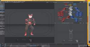
As such, I am creating a short animated sequence (on the order of three or four seconds) that includes an object moving as well as a camera zoom. Below is a screenshot of who I will be using as my test object:
As if there was any doubt that I was going to use a ninja! Actually, I originally set up a file with one of the characters from Taking Shape, but then I found it to be a poor choice due to the rather simplistic/ orthogonal geometry.
I am still working on the animated sequence, but I have done a few preliminary test renders for one AO technique. Below is a render with settings that I was happy with:
I haven’t put anything into After Effects for compositing. I intend on working through a few AO methods in LW before I export the renders. I believe this will be the best way for me to do a side-by-side comparison of the end results.
posted by Pi Visuals at 12:22 am
Tags: After Effects , Ambient Occlusion , Ninja Tales , ShapesComment
July 20, 2015 : Taking Shape Trailer
I meant to post this last week, but here’s the trailer for Taking Shape:
I didn’t spend as much time as I’d like on it (which is often the case for me with trailers), but I’m still happy with how it came out.
posted by Pi Visuals at 11:40 am
Tags: ShapesComment
July 11, 2015 : Alternate Taking Shape Sequence
Being nearly 15 minutes long, Taking Shape had a lot of dialogue it it. This required extensive audio recording, which meant sifting through the various takes. Often times, I am forced to choose between two good takes, leaving one unused.
For one scene, there was an audio take I chose not to use; however, I really liked it. As such, I decided to animate the sequence with it – even though it wouldn’t be used in the final project. Below is this unused sequence.
It was a tough decision not to use this take, but I felt it was the right one for the sake of the story. Even still, I like watching this sequence.
posted by Pi Visuals at 7:03 pm
Tags: ShapesComment
July 6, 2015 : Taking Shape Soundtrack
As done with several of my previous projects, I put together an mp3 that plays all the music created for Taking Shape. This Soundtrack is embedded below. Give it a listen:
[audio:http://www.pivisuals.com/wordpress/wp-content/uploads/2015/07/ShapesSoundtrack.mp3|titles=Taking Shape Soundtrack]For the most part, it plays the songs in the order they appear in the short. Although, they are the full, unedited versions. With over 7 minutes of music, it is the most I’ve had to record for a single project.
This is also the first time I used Adobe Audition to mix music for a short; and while there is plenty more to learn with the software, I am feeling pretty comfortable with the ins and outs. I also appreciate its capabilities. Between the EQing and Compression abilities, I believe the quality of the recordings were significantly improved versus my previous pipeline.
posted by Pi Visuals at 12:13 am
Tags: Pipeline , ShapesComment
June 30, 2015 : Taking Shape In The Can
Taking Shape, my latest short, is now complete. Final touch ups took place last week and has officially been minted ‘finished’. At the moment, I am not able to release it publicly (although if you send me a private request, I will be more than happy to point you to where it is located… assuming you ask nicely). In the meantime, below is a link to the Intro Animation for the project:
This clip was one of the last things done for the short. It was done after the rest of the animation for the project was finished (as well as its revisions). It was made entirely in After Effects – with some help from Photoshop.
Taking Shape clocked in at fourteen and a half minutes, making it one of the longer shorts I’ve done in recent years. I also employed a few new techniques during production, which I feel has improved the final result. I hope to make a few posts about these newly used methods over the next few weeks.
posted by Pi Visuals at 4:40 pm
Tags: ShapesComment
June 12, 2015 : Title Card Complete
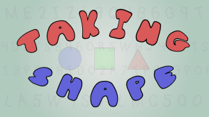
Post-production is still underway – there is a lot of music that needs to be written, recorded, and mixed – but that hasn’t stopped me from cranking about the Title Card for the short. Check it out below:
Normally, I try to crank this out earlier in the production process; but this time around things didn’t work out that way. Even still, I’m happy with how it came out.
As mentioned above, there is still a lot of music (and overall Audio) editing left. However, the deadline to complete the short is just over two weeks. As such, things will get done… one way or another. Currently, I am confident that not many corners will be cut.
posted by Pi Visuals at 12:31 am
Tags: ShapesComment
June 5, 2015 : Animation All Wrapped Up (Sorta)
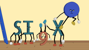
After several months, animation for the short is done. In order to make sure I gave myself enough time for post-production, I worked at a pretty feverish pace this past month. This was especially true since there were many action sequences – and ones that had many characters. Below is a screenshot from ones of those sequences that I am particularly fond of:
Technically, more animation still needs to be done. I’ve only completed the first pass and still need to take care of revisions. However, I’ve already gone through all of the scenes and the identified changes shouldn’t be too time consuming. Moving forward with the rest of post will then follow – including music, audio editing, and some additional video editing. With a deadline of the end of this month, hopefully everything will get done.
posted by Pi Visuals at 1:31 am
Tags: ShapesComment
May 23, 2015 : Animating With A Mirror – Follow Up
Based on a comment from my previous post ‘Animating With A Mirror’, I realized I did not discuss how I actually made the reflections. The technique is pretty straight forward but worth mentioning.
I decided not to use a mirrored surface in Lightwave – dealing with reflections greatly increases render times. Instead, I opted for a fake reflection with the help of After Effects. I first needed to create an extra render in Lightwave, which would be from the point of view of the mirror.
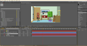
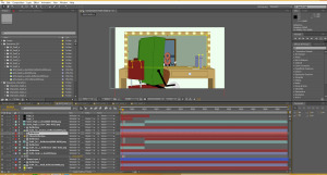
After that, it was time to put things into After Effects. I made a new solid (which I called Reflection’), and masked out the mirror. Below shows an example.
The mask is used with a Track Matte, something I use often, to appropriately project the Lightwave reflection renders onto the mirror glass. Below shows a series of these layers:
The last step to accurately create the mirrored look was to flip the image horizontally. That makes it appear like a reflection. Below is a nice example which also has depth by showing a reflection not inherent in the main shot.
And that is pretty much how I create the mirror look for the scene. At times, this technique became tedious – particularly when there were a lot of items/ objects in the shot; however, it was easily manageable, and I was able to control the various layers as needed.
posted by Pi Visuals at 1:58 am
Tags: ShapesComment
May 14, 2015 : Group Scene – On Steriods
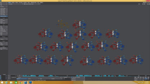
The current scene I am animating is a large one. It has plenty going on – as well as a lot of characters in it. The sequence I am specifically working on is very intense. Below is a screenshot of Lightwave’s Schematic View (which shows the various objects within the scene file):
Each red/white/blue cluster represents a character. As the image above shows, there are twenty of them in this file. This specific sequence is needed to establish many of the upcoming closer shots, which is why I need a file with this many characters. Right now I am getting all the characters in place for the sequence, and then I plan on splitting things up into groups of characters via sub-files.
In the past, there was no way I would have been able to work on a file like this. My previous computers would slowed to a crawl after four or five characters. Ever since my new computer was built, I noticed a significant increase in performance (to be fair, my last previous computer was  about ten years old). However, even this has exceeded my expectations. This does appear to be reaching a reasonable limit as the  scene is running a little slower than normal – but not nearly as bad as my other computers did when it got bogged down. Plus, with twenty characters, I can’t really complain.
posted by Pi Visuals at 12:08 am
Tags: ShapesComment

