December 25, 2024 : Tis’ the Season – For A Gingerbread House Design
This year’s Holiday card was a bit of a rush job – due in part to the lateness of Thanksgiving but mostly because of a personal obligation. Specifically, the construction of a new house that is wrapping up. I leaned into said obligation as inspiration for the card and created a gingerbread rendition of the blueprint (the bottom is cropped out to remove our address).
The process was very straightforward. After looking around online for some inspiration/references, I jumped into Illustrator and designed everything in there. I wanted the simple illustration look so there was no need to go into anything else (such as After Effects of Photoshop). Overall, I like how it turned out. Particularly given the concept and my availability. Happy Holiday, all!
posted by Pi Visuals at 12:52 am
Tags: Holidays , IllustratorComment
August 24, 2018 : Print Problems – Ink Saturation Levels
I don’t often work in the print realm, but I enjoy challenges – which is why I was happy to illustrate a Children’s Book for a client last year. Overall, the project was a fun exercise in illustration. However, it did come with some challenges… specifically, Ink Saturation Levels (the sum of the CMYK Percentage Components).
The printing company my client used has a limit of 240%, a threshold that can vary dependent on the type of project and equipment. While a limit as high as 280% is not uncommon, this was something not on my radar while designing the characters in the book. So when the printing company came back detailing issues with the submitted files, I had to do plenty of research on the topic of Ink Saturation Levels.
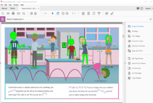
It turns out Adobe Acrobat has the ability to highlight colors above a pre-determined limit. Below shows an example of the output:
The next step was determining a course of action to remedy the situation. The more thorough (and tedious) solution would have been going back into Illustrator and change each offending color. However with deadlines and workloads as they are, I ended up importing the pages (in PDF form) into Photoshop. From there I was able to reduce the ink density and re-export the PDF’s. These were than recompiled to form a revised Master PDF file.
Overall, it was an adventure into the Print Realm, and the lessons learned were invaluable for future projects. As for this project, the hope is that the book will begin printing in a few weeks, and I am looking forward to seeing the final product.
posted by Pi Visuals at 11:27 pm
Tags: Client Work , IllustratorComment
July 13, 2018 : Cartoon Portal Fun
For a while now, I have wanted to create a Cartoon Portal. I had some time lately so I tested around with some things in After Effects. Below is the final result (with sound effects!):
One piece of line art was made in Illustrator and used as the basis for the various layers.
I still need to send something (or someone) through the portal, but I don’t think it’s ready for that just yet. The technology is still in the beta stages and will require more testing. Just kidding – that is the next step. I intend on using a previously made Lightwave character.
posted by Pi Visuals at 10:10 am
Tags: After Effects , Illustrator , Lightwave , MeAndMeComment
December 24, 2017 : Holiday Card – Scrapped Versions
For the first time ever, I made a Holiday Card this year. Below is the final product:
Overall, I like how it came out. Much like what was discussed in my previous post, there were several major versions required to get to the above – even though this was a personal project. One of the earlier iterations had a Snowman. It was very simple, but I liked it’s feel and was disappointed with not being able to use it.
The ornament overlay works better with the mosaic look of the other photos, but I enjoy the cartoon look of the Snowman. It was made in Illustrator, and I intentionally excluded edges. I didn’t think they would mesh well over the photos. Ultimately, it was the right call to not have the Snowman, but perhaps I’ll think of a use for him in the future.
posted by Pi Visuals at 12:14 am
Tags: Holidays , IllustratorComment
November 8, 2016 : Politics And Illustrator
I usually don’t get political… so I won’t (if only all Facebook posts that start this way would end like that as well).
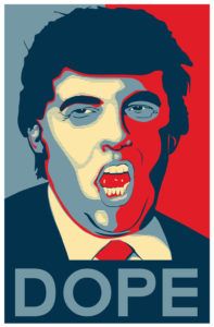
Anyway, with today being Election Day, I figured I’d share a quick project I was asked to do a few weeks back in Illustrator. Somebody I knew asked me to design a shirt that took after Obama’s Hope Poster and replace it with Donald Trump… and with a slightly different slogan. Below is the end result:
At the request of my friend, several slogans were used besides ‘Dope’- including Nope, Grope, Hate, Despair, and Loser.
Politics aside, it was a fun project. It required some research (the original artist of the ‘Hope’ poster is Shepard Fairey). While I could have created the image in Photoshop, I ended up going with Illustrator. It took longer, but gave me more control with the color scheme.
Since I use Illustrator sporadically, I always enjoy an opportunity to fine tune my skills with the program. One aspect of the project I particularly liked was the frequent use of ‘clipping masks’. It is a technique I used in a while but gave me the control I wanted over the skin tone colors.
Lastly, I suppose it’s mandatory to remind people to go out and vote.
posted by Pi Visuals at 11:37 am
Tags: IllustratorComment


