December 25, 2024 : Tis’ the Season – For A Gingerbread House Design
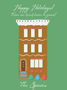
This year’s Holiday card was a bit of a rush job – due in part to the lateness of Thanksgiving but mostly because of a personal obligation. Specifically, the construction of a new house that is wrapping up. I leaned into said obligation as inspiration for the card and created a gingerbread rendition of the blueprint (the bottom is cropped out to remove our address).
The process was very straightforward. After looking around online for some inspiration/references, I jumped into Illustrator and designed everything in there. I wanted the simple illustration look so there was no need to go into anything else (such as After Effects of Photoshop). Overall, I like how it turned out. Particularly given the concept and my availability. Happy Holiday, all!
posted by Pi Visuals at 12:52 am
Tags: Holidays , IllustratorComment
December 23, 2023 : Digital Candy Cane Breakdown
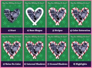
I really liked how the candy canes turned out in this year’s Holiday card. It took a few steps to get to the end result so I figured I’d share the progression:
I ended up using After Effects – technically, the base shapes were done in Illustrator when I was creating the card’s general layout, but this could have easily been done in AE as well. I’m sure Photoshop would have been just as capable, but I used a fair amount of mattes, masks, and blending modes; and I am more comfortable doing that in AE.
Originally, I was planning on going with a more illustrative look so I could have easily stopped at #3 or #4; but as I kept working through things, I liked the realistic look more and more. The shadows/highlights really helped achieve the look I wanted, but I think the unsung hero that really sold it was the noise layer.
posted by Pi Visuals at 12:34 am
Tags: After Effects , Candy Cane , HolidaysComment
December 15, 2023 : Tis’ the Season – For Digital Candy Canes
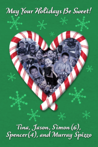
Another year, another Holiday Card. For those keeping track, this is the seventh year I made one with/for the family. Here’s number 7:
Every time it seems like a rush job; but by keeping things simple, I feel it was pretty manageable this year. As always, there are a few things I would have liked to tweak a little more, but overall I’m pleased with the end result.
I’m a big fan of the candy canes, which were created in After Effects. In fact, the whole card was done in AE (with a splash of Illustrator) versus using Photoshop. This was mostly due to my comfort level with the software, as I’m sure it could have been done easily in PS. I plan on writing up a quick post describing the steps. It wasn’t too complicated but there were a series of layered effects, which gave a solid look.
posted by Pi Visuals at 12:04 am
Tags: After Effects , Candy Cane , HolidaysComment
January 21, 2023 : Tis’ the Season – For An Overdue Post About A Holiday Card
I meant to crank out a quick post last month highlighting the most recent Holiday card, but I guess I never got around to it – which is weird since this Holiday season wasn’t particularly busy. Well, better late than never:
The theme for this last year’s card (number 6, by the way) was locked in pretty early. The same goes for the layout and photos. However, there was a lot of back and forth with the coloring and smaller design details. I’m used to tweaking things to death, but this one seemed more than usual. Either way, I was happy with the final product – and a few ideas were even brainstormed (and documented) for next year.
posted by Pi Visuals at 12:08 am
Tags: HolidaysComment
December 10, 2021 : Tis’ the Season – For A Simple, Yet Quaint Holiday Card
In addition to the normal Holiday hubbub, I also took on a side project. Even with things being so hectic, I still made time to create this year’s Holiday card:
This marks the fifth straight year of making the card, which I’m proud of. Although, I must say this year was light on design. In fact, I had a more detailed background in earlier versions but pulled it back to the more simplified one seen above.
That said, I still like the overall aesthetic and its message. I suppose the people in the photos aren’t bad either.
posted by Pi Visuals at 11:54 pm
Tags: HolidaysComment
December 11, 2020 : Tis’ the Season – For This Year’s Holiday Card
During the Me and Me wrap up, some time was allocated to this year’s Holiday card:
The lift was minimal, compared to previous years; but it was nice to hop into Photoshop… it’s been too long. Small projects like these serve as a good break.
posted by Pi Visuals at 11:42 am
Tags: HolidaysComment
December 24, 2017 : Holiday Card – Scrapped Versions
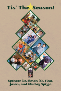
For the first time ever, I made a Holiday Card this year. Below is the final product:
Overall, I like how it came out. Much like what was discussed in my previous post, there were several major versions required to get to the above – even though this was a personal project. One of the earlier iterations had a Snowman. It was very simple, but I liked it’s feel and was disappointed with not being able to use it.
The ornament overlay works better with the mosaic look of the other photos, but I enjoy the cartoon look of the Snowman. It was made in Illustrator, and I intentionally excluded edges. I didn’t think they would mesh well over the photos. Ultimately, it was the right call to not have the Snowman, but perhaps I’ll think of a use for him in the future.
posted by Pi Visuals at 12:14 am
Tags: Holidays , IllustratorComment


