May 6, 2015 : High Rent Increase Forces Cartoon Museum To Move
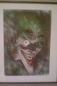
Two years ago, I went to the San Francisco Cartoon Art Museum. It wasn’t Earth shattering, but there were some cool pieces – including the one below. To be fair, the featured exhibits that were there when I went weren’t really my cup of tea. It sounds like they have had a lot of really interesting exhibits over the years.
Sadly, they will have to show these cool exhibits in another location. The building it currently occupies is significantly raising its rent (it is to be doubled), and this will force the museum to vacate by the end of June. It has been around for nearly 30 years and have been in its current location for nearly 15. While no specific relocation plans have been made, they do intend to relocate as opposed to shutting down.
For the record, the museum seems to be taking the change in stride. According to their website: “This is just another chapter in the life of the Cartoon Art Museum.†reflects Executive Director, Summerlea Kashar, “We’ve been here before with the first dotcom bubble, which landed us in the current location.  Our landlords have been very upfront about the rental market, and actually have been one of our largest contributors over the years.â€
It’s a bummer that high rent is forcing them out; but I suppose in San Francisco, it shouldn’t be too surprising. Still, you have to like the museum’s reaction to the events. They could easily be bitter and petty – but instead, they are positive and optimistic about its future. I find that pretty refreshing. Now, get a Batman exhibit lined up.
posted by Pi Visuals at 1:37 am
Tags: ComicsComment
May 13, 2013 : San Francisco’s Cartoon Art Museum
During mid-April, I got a chance to go to San Francisco for a few days (yeah I know, I’m a little late relaying the info). While there, I found out the hotel I was staying at was very close to the Cartoon Art Museum. So naturally, I made sure to check it out.
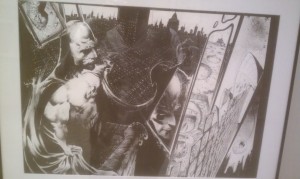
To be honest, I wasn’t overly impressed – however, after thinking about it since I went, I’m pretty sure a lot of that can be attributed to me being spoiled with Chicago’s Museums. It did feel like many genres were left out; and they seemed to focus more on comics than animation. Still, there were some cool pieces. Below are two pieces I liked by comic book writer/ illustrator Sam Kieth.
I like most drawing of The Joker, but this one was particularly sweet and clearly needs to be followed by:
Kieth has created his own comics but has also been involved with DC properties. With this artwork, I am curious to check out the five issue Batman series he wrote and drew.
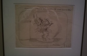
The museum rotates and changes out exhibits periodically. At the time of my visit, they did have a good portion of space dedicated to Chuck Jones, which was pretty cool. There was a great deal of artwork by him – in various steps of production:
The Chuck Jones exhibit was by far the most informative. Among other things, I learned that he directed the TV adaption to How The Grinch Stole Christmas! – a personal favorite of mine.
Overall, the museum was worth the few bucks I shelled out… but I wouldn’t recommend having incredibly high expectations. Although, I’m willing to bet your experience is dependent upon when you go. If they have a really great exhibit when you’re there, then it will be that much better.
posted by Pi Visuals at 12:24 am
Tags: Batman , Comics , Joker1 Comment | Post a comment
March 23, 2009 : Make A Hero
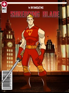
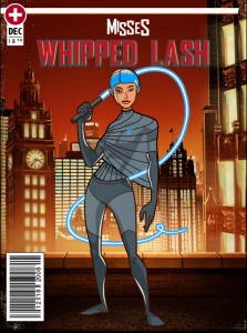
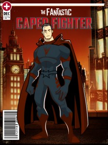
Here’s a cool website that allows you to create a hero. It could be in your mold or just completely off the wall. Either way, it was a cool way to burn a few minutes. Here’s mine:
The designs have that Flash look to them, but I still like it. Plus, it’s tough not to enjoy the computer generated titles – I think mine’s awesome and stays true to its inspiration.
Feel free to send me a cool pic of yours – maybe we can get a new group of crime fighters. They wouldn’t be able to hold a candle to The Super Friends, but then again, who can?
UPDATE
Two images submitted from readers to accompany ‘The Intimidating Shredding Blade’. You can also find the second one via the comments section. As a side note, mine still looks the coolest.
posted by Pi Visuals at 1:58 pm
Tags: Comics2 Comments | Post a comment


