November 16, 2014 : Behind The Scenes – Raining Platform Part 4: Fake Lighting
The last subject in Raining Platform’s Behind-The-Scenes thread is the fake lighting for the lamp posts. This wasn’t a major effect, but it was a nice detail that came out nicely and was worth sharing. I considered creating the lighting in Lightwave. However, since I was using multiple renders on different layers, I didn’t think this was the best way.
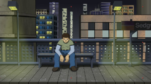
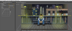
To better show the final post lighting, below is a shot without the rain. Notice how the opacity of the yellow light is greater near the platform and gradually becomes more transparent as it reaches the source:
I began with a yellow solid. To taper its transparency, I used a Track Matte. Below shows the setup of this in After Effects.
The yellow solid layer is [Faux Light]. By selecting a Luma Track Matte, the opacity of the Faux Light layer will be dictated by the brightness of the image above it (in this case [Gradient]). When the Gradient layer is white, Faux Light will have a 100% Opacity. Conversely, when the Gradient layer is black, it will be completely transparent. As a side note, you can also use Track Mattes with an Alpha setting – where a layer’s opacity will be dictated by the above layer’s opacity. This is another technique I commonly used.
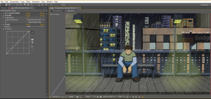
Back to this project, to have the Faux Light layer get progressively more opaque the further down it goes, I created a simple black/ white gradient via the Ramp effect. Below is that gradient (for the Gradient Layer):
It took a little tweaking to get the gradient exactly how I wanted. To make the effect more subtle, the top part of the gradient wasn’t pure black nor was the bottom part pure white. I then set the Blending Mode for the Faux Light layer to Screen and lowered it’s opacity a little more (just for good measure).
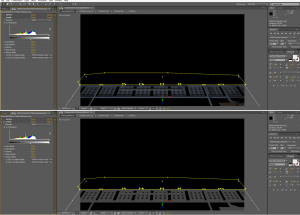
The last step was creating the masks to outline the actual shape of the light. Below shows the solo-ed light without the Track Matte (top) and with the Track Matte (bottom).
And that is how I was able to get the lighting for the posts – done entirely in After Effects. Using Track Mattes to taper the layer’s opacity made for a nice, subtle touch that I was particularly proud of.
Well that wraps up the forth (and final) part of the Behind-The-Scenes for Raining Platform. They all focused on work done in After Effects, which did most of the heavy lifting in this project. Honestly, much of what I did was pretty straight forward and didn’t require a great deal of knowledge. All you really need is the basic ability of knowing how to navigate through the program and then toying around with its features.
Anyway, if you have any other questions, or would like to hear about another aspect of the animation, feel free to hit me up – I wouldn’t be against making another part or two if its on a subject worthwhile.
posted by Pi Visuals at 6:03 pm
Tags: Behind The Scenes , Raining PlatformComment
November 12, 2014 : Behind The Scenes – Raining Platform Part 3: Lightning Effect
The next subject in the Raining Platform’s Behind-The-Scenes thread is the lightning. I wasn’t sure how to simulate the lighting flash associated with lightning so I did some research. Prior to any work in After Effects, I searched for examples in animation as reference. I found them in American Dad (G-String Circus) as well as multiple South Park episodes (most notably, Professor Chaos).
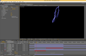
Once in After Effects, the first step was to create the lightning bolt. This was fairly simple with AE’s ‘Advanced Lightning’ effect. The settings were pretty self explanatory but required some testing to get things exactly how I wanted. Below is a screen shot of the lightning. The bolt only needed to extend halfway down the screen since the foreground buildings would obscure the rest of the view.
At the bottom of the screen, you can see two main sets of keyframes – which represent the two lightning strikes during the short. The ‘Origin’ and ‘Direction’ parameters were varied during these stretches to animate the bolt.
The next step was to create the drastic lighting associated with the lightning bolt. Below shows these two extremes.
The lightning flash effect was just duplicated layers with a color correction applied. For the character and sign, the layer was significantly darkened. Conversely, the platform, buildings, and sky were brightened. The trick here was to determine an easy way of toggling between the lightning ‘on’ and ‘off’ extremes.
This was done by first creating a hidden dummy layer. This layer’s opacity was keyframed to indicate when the flash was to be employed (basically going from 0% to 100%). A simple expression was added to the duplicated layers (that represent the extreme), which would link their opacity to this dummy layer. The image below helps illustrate this:
Layer 8 (‘LineArt.png 2’) is the dummy layer. On the right side of the image, you can see the two lightning strikes. By adding the expression at the bottom of the image, Layer 9 will track with the dummy layer. Layer 9 was a severely darkened version of the character so I decided to have its opacity only 85% of the dummy layer’s opacity.
This layer sits on top of the original LineArt layer. As such, with only 85% opacity, some of the original character image is still visible. The top part of the above image shows when there is no lightning (the dummy layer is 0% and so is the darkened LineArt layer). Similarly, the bottom part of the image shows the lightning flash (the dummy layer is 100% and so the darkened layer is 85%). The Opacity for Layer 9 is in red because it is linked to Layer 8 via the expression. The ‘on’ and ‘off’ keyframes were typically two frames apart. Although, to ensure the timing of the flashes weren’t too uniform, I occasionally made it more abrupt and had them right next to each other.
Each layer had a different ‘factor’ as to how it correlated with the dummy layer. While the LineArt layer mentioned above used .85, many used a factor of 1 and some used another value. This was something I had to test out for each layer. The great thing about using the dummy layer and associated expression is when I had to tweak the timing of the lightning flash, I only had to adjust the keyframes in the dummy layer. The rest of the flash layers did not have to be touched.
The last step was to create the shadows of the railing, sign, and character that transposes onto the platform. The process for this was similar to the other layers described above, however, it required an extra step. The duplicated layers were converted to 3D layers and then rotated to match the angle of the shadow on the platform. I also had to mask out unwanted parts of the image. The layer then gets de-saturated with the Levels effect, and it is ready to be used as a shadow (with an opacity around 50%). The image below shows the layer with and without Levels.
This process was also done for the Line Art layer to create the character shadow on the platform, which wraps up the work needed to create the lightning and its flashes. I definitely learned a good amount in the process, and it wasn’t overly time consuming. I believe using the expression saved a great deal of time since it made it easier to visualize the final product of the lightning flashes and then tweak as necessary.
The next, and last, post will cover the fake lighting for the light posts. I was pleased with the technique used to get the desired look and wanted to share it.
posted by Pi Visuals at 1:41 pm
Tags: Behind The Scenes , Raining PlatformComment
November 8, 2014 : Behind The Scenes – Raining Platform Part 2: Rain Effect
The next topic to cover in the Behind-The-Scenes for Raining Platform is the Rain Effect. The visual aspect that sold the weather for the short was the foreground rain. This was created via the CC Particle World Effect. I toyed around with the settings to get the look I was going for, and I don’t want to go through every setting used; but the animation producer was ‘Direction Axis’ and the Particle Type was Line.
To add depth to the rain, I increased the radius of the particle producer on the Z-axis. This varied the apparent particle sizes. Lastly, to soften the droplets, I added a small amount of blur to the layer.
To help sell the rain, I added a ‘Splash Up’ layer. This was to mimic the rain splashing/ bouncing back off the platform railing and sign. This was a new layer with rain particles. The setting were similar to the main Rain layer, but the main difference was increasing the number of particles and having the direction straight up and down (versus a slight diagonal angle). The layer was pre-composed, which allowed me to create masks to isolate the specific locations for the splashing. The image below shows these masks.
The masks were slightly feathered to soften the effect. Just as before, I added a small blur. To help differentiate this layer from the main rain, the Splash Up layer was significantly lightened via Curves.
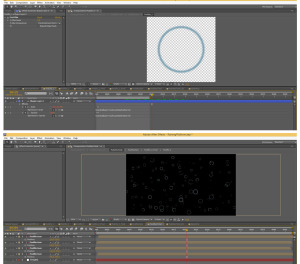
The last element added to cement the rain effect was the puddles on the platform. To do this, I created a composition with a Shape Layer of a circle. I set keyframes for its size and opacity so that it starts small and expands out (while eventually fading out). With the Size and Opacity keyframes set, I added the expression “loopOut(type=’cycle’, numKeyframes=0)” to each of these parameters.
This expression loops the animation I created to continue through the length of the layer (rather than just occurring once). The great thing about this is if I feel the circle is moving too slow or fast, I only need to adjust the original keyframes, and the animation will loop to the new speed.
After the initial Puddle layer is created, I made a few similar, but slightly different, layers just for the sake of variety. I even used a few masks so the some of the circles aren’t always connected. These Puddle layers were then placed into a new composition (called PuddleSum) at varying sizes and locations. I believe there were about 50 copies of the various Puddles layer in the PuddleSum composition. It was a little time consuming to get everything where I wanted, but it wasn’t too cumbersome.
I then placed several copies of these PuddleSum compositions into a final PuddleTotal composition. The image below shows the original Puddle composition on top, and then the PuddleTotal composition below it.
Things get a little tricky here. I then put the PuddleTotal comp into a new composition (called PuddleTotal2D). The PuddleTotal comp is turned into a 3D layer and rotated on the x-axis to match the orientation of the platform. Now I could have done this directly in the final composition. However, this would have resulted in problems because I would not have been able to put it behind the foreground train layer while still keeping it in front of the rest of the other layers (layer order of 3D layers with 2D layers can be tricky like that). As such, I took this final 2D comp and placed it in the final composition. I then used a few masks to ensure the puddles stayed only on the platform.
That’s about it for the Rain effect. It might appear a little complicated, and I probably could have used a few more pictures to illustrate my workflow; but it honestly wasn’t as difficult as it sounds. Also, sorry for using the words ‘Puddle’ and ‘Composition’ way too much in this post. Still, I hope it helped explain things… even if only for a little. Next time, I will cover the Lightning Effect – along with the lighting that results from the strike.
posted by Pi Visuals at 12:49 am
Tags: Behind The Scenes , Raining PlatformComment
November 5, 2014 : Behind The Scenes – Raining Platform Part 1: Overview
So after the numerous requests by countless readers, I decided to make a few posts discussing how the Raining Platform animation was made (I am thinking there will be four in all). Since a lot of the heavy lifting for the clip was done in After Effects, I’m going to focus on the work done in this program.
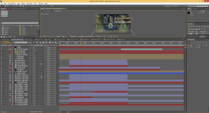
For this post, I will briefly cover a few high-end topics about the animation. Below is a shot of the final composition within After Effects.
As you can see, there were plenty of layers and elements that went into the final composition. To illustrate visually how much After Effects transformed things, below is a before and after for the first frame.
One of the first things that should stand out is how much darker the final image is. Darkening the various elements was done to adequately convey the stormy, nighttime setting. This was actually one of the last steps done, but I wanted to touch upon it briefly. I like using the Curves effect for this, and below was a typical setting I used for each of the layers:
Curves was used on many of the layers; and I could have used an adjustment layer to darken the project as a whole, but I like individually tweaking the brightness for each layer since some needed it more than others.
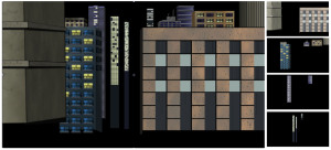
The next topic to cover is the background buildings. There were a total of 12 buildings created in Photoshop. I saved these out to four different images, which was done to differentiate between the closer buildings and the farther away ones. The image below shows the final background on the left, along with the four Photoshop-created files to the right.
In addition to Curves to darken things, I used a slight Gaussian Blur on the farther back buildings to fake a Depth-Of-Field look. The buildings received less and less of a blur up until the foreground buildings, which had none. I considered using more blur in the farther back images, but I wanted a more subtle look. I’m not sure how noticeable the effect is, which is what I was going for.
That’s enough for this ‘Behind The Scenes’ post. Next time, I will discuss how I created the rain elements.
posted by Pi Visuals at 9:50 pm
Tags: Behind The Scenes , Raining PlatformComment

