April 16, 2021 : Dolly Zoom Exploration
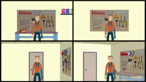
I finished up my quick Dolly Zoom Study. Several versions were created for review – using the same character movement but changing the background. I also threw in animated color corrections to better sell it in After Effects. Below is the final compilation (click on the image for the GIF to animate):
From a technical perspective, performing the maneuver digitally was very easy. I had full control of the camera and was able to tweak things to get things how I wanted.
The background composition sold the effect. Having a flat one dimensional BG (upper right) made things very dull and ineffective. Similarly, the upper left version added depth with the workbench, but it moved in parallel to the Character… not in contrast, thus limiting its value.
The lower left version did have two walls in the shot, and I felt it was an improvement; but the lower right had the most dynamic staging. As such, it had the most dramatic. Overall, it was a cool exploration into the Dolly Zoom, and I’m glad I have it in my skillset moving forward.
A footnote: this was done in Lightwave 2015… I still don’t have much of a clue how to use 2020.
posted by Pi Visuals at 11:35 pm
Tags: After Effects , Lightwave , The Dolly Zoom

